Back-to-school mobile snapshot
This week I took a look at mobile phone usage on the VCU Libraries website for the first couple weeks of class and compared that to similar time periods from the past couple years.
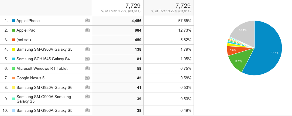
2015
Here’s some data from the first week of class through today.
Note that mobile is 9.2% of web traffic. To round some numbers, 58% of those devices are iPhones/iPods and 13% are iPads. So we’re looking at about 71% of mobile traffic (about 6.5% of all web traffic) from Apple devices. Dang. After that, it’s a bit of a long tail of other device types.
To give context, about 7.2% of our overall traffic came from the Firefox browser. So we have more mobile users than Firefox users.
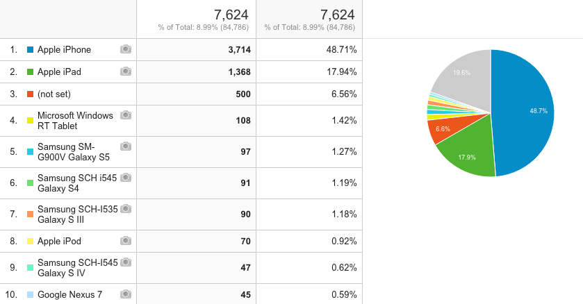
2014
Mobile jumped to 9% of all traffic this year. This is partially due to our retiring our mobile-only website in lieu of a responsive web design. As with the other years, at least 2/3 of the mobile traffic is an iOS device.
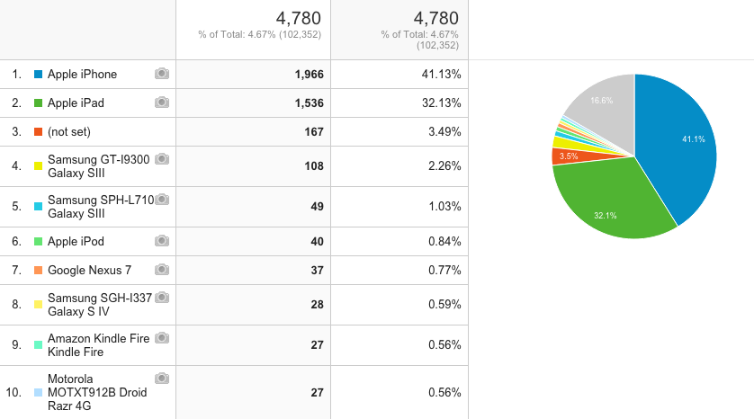
2013
Mobile was 4.7% of all traffic; iOS was 74% of all traffic; tablets, amazingly, were 32% of all mobile traffic.
I have one explanation for the relatively low traffic from iPhone: at the time, we had a separate mobile website that was catching a lot of traffic for handheld devices. Most phone users were being automatically redirected there.
Observations
Browser support
Nobody’s surprised that people are using their phones to access our sites. When we launched the new VCU Libraries website last January, the web team built it with a responsive web design that could accommodate browsers of many shapes and sizes. At the same time, we decided which desktop browsers to leave behind – like Internet Explorer 8 and below, which we also stopped fully supporting when we launched the site. Looking at stats like this helps us figure out which devices to prioritize/test most with our design.
Types of devices
 Though it’s impossible to test on every device, we have targeted most of our mobile development on iOS devices, which seems to be a direction we should keep going as it catches a majority of our mobile users. It would also be useful for us to look at larger-screen Android devices, though (any takers?). With virtual testing platforms like BrowserStack at our disposal we can test on many types of devices. But we should also look at ways to test with real devices and real people.
Content
Thinking broadly about strategy, making special mobile websites/m-dots doesn’t make sense anymore. People want full functionality of the web, not an oversimplified version with only so-called “on-the-go” information. Five years ago when we debuted our mobile site, this might’ve been the case. Now people are doing everything with their phones–including writing short papers, according to our personas research a couple years ago. So we should keep pushing to make everything usable no matter the screen.
