A new look for search at VCU Libraries
This week we launched a new design for VCU Libraries Search (our instance of Ex Libris’ Primo discovery system). The guiding design principles behind this project:
- Mental models: Bring elements of the search interface in line with other modern, non-library search systems that our users are used to. In our case, we looked to e-commerce websites as a model for some search design patterns. The context is not a perfect 1:1 match, but the comparisons proved useful.
- Aesthetic Integrity: make the visual design more coherent, consistent, and attractive.
- Progressive disclosure: make the system more approachable for novice users by simplifying the interface, while keeping options for advanced users available on demand. The Apple Human Interface Guidelines explain this concept well.
Before and after


Following our guiding principles, we:
- Hid many elements, most of them text elements.
- Added expand/collapse functionality to the left-hand facet list, with the exception of the date facet, which remained open.
- Incorporated Notre Dame’s improvements to the date slider.
- Gave the facet lists and the search result items more visual breathing room.
- Standardized fonts and text sizes.
- Added VCU branding and colors and incorporated fonts and design themes from the main VCU Libraries website.
- Made the pagination links bigger for fat fingers/clickers.
- Optimized for tablets and handheld devices.
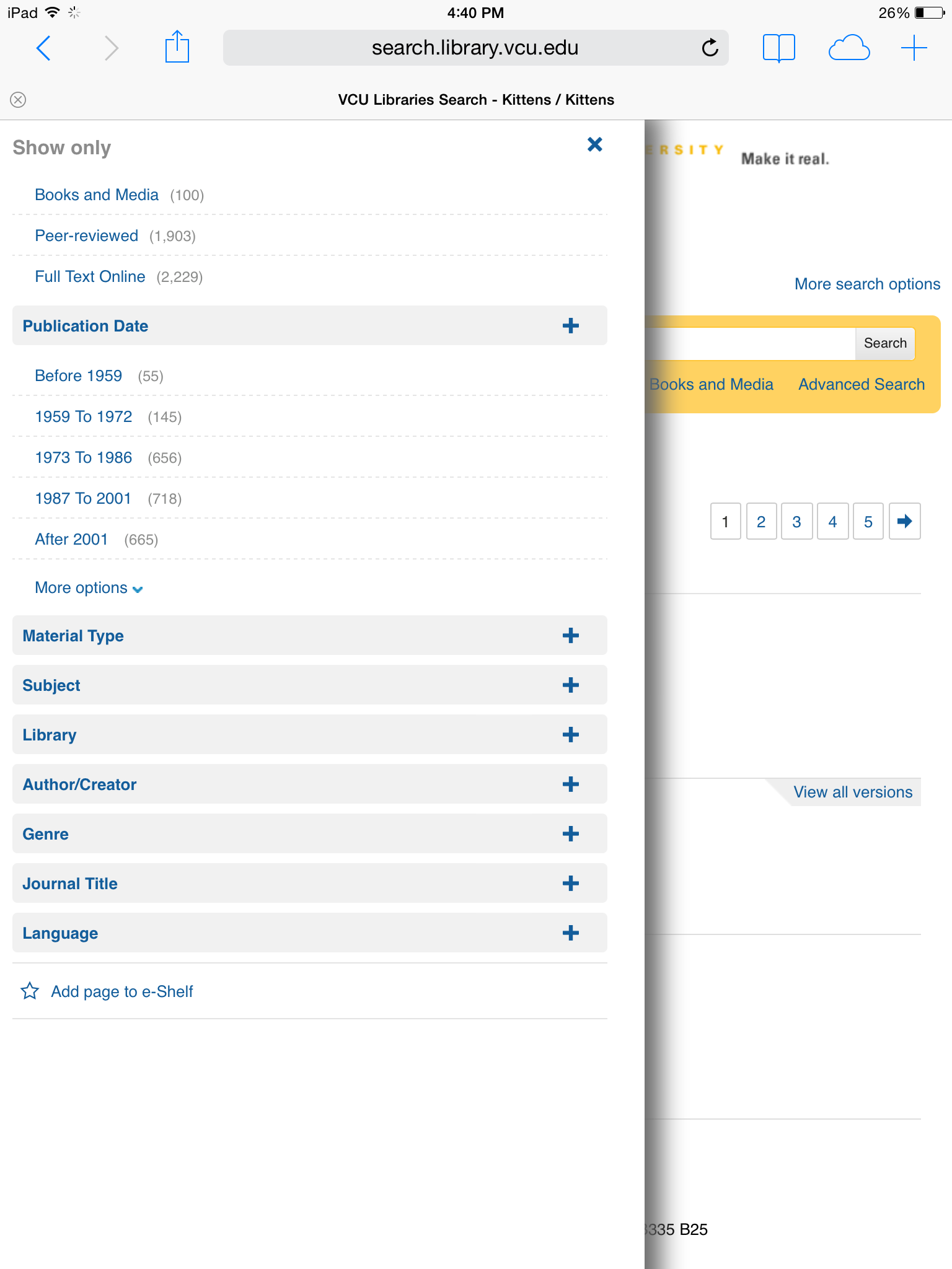
Optimizing for mobile
Tablet
On the tablet view, facets are hidden and slide out into view when the “filter options” link is selected. We chose the “filter” wording based on language we saw on a few mobile-enabled shopping websites, particularly Target and Amazon. Links to more search options (new search, databases, citation linker) are collapsed into a dropdown menu. Advanced options are there, just another click away. Because the date slider does not work on touch devices, we’ve hidden it and replaced it with a text list.


Handheld
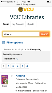 For the handheld view, we removed the advanced search and citation linker options entirely. I’d like to bring them back when their layout is better optimized for smaller screens. The link to filter results is prominent, and the juicier pagination links are especially helpful on the smaller screen. Our institutional branding is still there but centered and ensmallened.
Next steps
We’re only in the first week of this new interface but already feel that it’s a vast improvement over the previous design. In the next few months we’ll solidify our development/deployment process and refine, refine, refine. I’d like to do some usability assessments of the interface as well.
Credits
This was truly a collaborative effort between our web team and enterprise systems team. Web designer Alison Tinker worked closely with systems librarian Emily Owens to get the technical details just right. Tom McNulty and I helped frame the project and consult on design questions. And many librarians across the organization gave helpful feedback in our demo session and on our blog posts (many people saying “you should hide more stuff”, which I deeply appreciate).
Code
For our own sanity and maintainability’s sake, no JSP files were harmed in the making of this redesign. The CSS and Javascript customizations for this redesign are up on GitHub.
